Thingography.com https://thingography.com More than a Photo Gallery Thu, 29 Nov 2018 03:12:57 +0000 en-US hourly 1 CSS Animation: Airplane Banner https://thingography.com/vid-airplane-banner/ https://thingography.com/vid-airplane-banner/#respond Wed, 07 Nov 2018 19:25:18 +0000 https://thingography.com/?p=2676 This video is screen capture of a CSS animation that can be found here – https://thingography.com/css-airplane-banner/ – one of my first animations – a bit crude

]]>
https://thingography.com/vid-airplane-banner/feed/ 0
CSS Page Transition Animation https://thingography.com/css-transition/ https://thingography.com/css-transition/#respond Mon, 26 Mar 2018 17:46:51 +0000 http://thingography.com/?p=2393 .ani-box { margin: 0 auto; width: 100%; height: auto; position: relative; padding-bottom: 2em; top: 0; }

Page One – Losira Out

These examples of true transitional web pages are based on the Curtains and Transitional Advertisements demos. Web pages can be transitioned for enhanced
viewing just as photos are transitioned.

Trekies will remember the beautiful Kalandan Commander – Losira – whom inspired the first transition style.

First choose the movement direction of the ad…
Losira Out Scale Out Rotate Out

Continued on page two….

]]>
https://thingography.com/css-transition/feed/ 0
CSS Page-2 Transition Animation https://thingography.com/css-transition-2/ https://thingography.com/css-transition-2/#respond Mon, 26 Mar 2018 17:46:21 +0000 http://thingography.com/?p=2397 #ani { margin: 0 auto; width: 100%; height: auto; position: relative; padding-bottom: 2em; top: 0; }

Page Two – Losira Out

The Losira page transition also has an “onClick” audio as an added effect to go along with the page theme. The so called “Losira” effect was born from the Star Trek episode “That Which Survives” and is similar to the manner in which Kalandan commander transitioned out of the scene. This page style was included to show how transitions can add to a webpage’s theme or character.

First choose the movement direction of the ad…
Losira Out Scale Out Rotate Out
then view a few pages of that ad style.

Continued on page one….

]]>
https://thingography.com/css-transition-2/feed/ 0
Trans Man Page-2 CSS Transition https://thingography.com/css-trans-man-2/ https://thingography.com/css-trans-man-2/#respond Sun, 25 Mar 2018 23:59:24 +0000 http://thingography.com/?p=2387

Page Two

Other ideas include a monster trucks and bull-dozers pushing the page to transition… more ideas on next page…

Click the buttons below to watch the ‘Trans-Man’ page transition


]]>
https://thingography.com/css-trans-man-2/feed/ 0
Trans Man Page CSS Transition https://thingography.com/css-trans-man/ https://thingography.com/css-trans-man/#respond Sun, 25 Mar 2018 23:59:15 +0000 http://thingography.com/?p=2382

Page One

The effect is a man pushing the web page off screen forcing the next one to replace it…

Click the buttons below to watch the ‘Trans-Man’ page transition


]]>
https://thingography.com/css-trans-man/feed/ 0
Transitional Ads Page 2 https://thingography.com/css-transad-2/ https://thingography.com/css-transad-2/#respond Sun, 25 Mar 2018 17:45:18 +0000 http://thingography.com/?p=2360

Page Two – Horizontal Slide

The idea in this example is to slide in an advertisement or notice on the page without cluttering up the page content or using popups, comparable to a commercial between television shows. Here are a few different sliding styles to demo.

view a couple of pages of the ad style.

]]>
https://thingography.com/css-transad-2/feed/ 0
Transitional Web Page Advertisements with CSS Animation https://thingography.com/css-transad/ https://thingography.com/css-transad/#respond Sat, 24 Mar 2018 22:51:52 +0000 http://thingography.com/?p=2325

Page One – Horizontal Slide

The idea in this example is to slide in an advertisement or notice on the page without cluttering up the page content or using popups, comparable to a commercial between television shows. Here are a few different sliding styles to demo.

view a couple of pages of the ad style.

Continued on page two….

]]>
https://thingography.com/css-transad/feed/ 0
All Round CSS Image Menu https://thingography.com/css-menu/ https://thingography.com/css-menu/#respond Sat, 24 Mar 2018 16:13:55 +0000 http://thingography.com/?p=2296 .ani-box { margin: 0 auto; width: 100%; height: auto; position: relative; padding-bottom: 2em; } #wrapper { margin-right: auto; margin-left: auto; width: 100%; height: 600px; position: relative; margin-top: 0.1em; padding-bottom: 2em; } .switch1, .switch2, .switch3, .switch4 { border: 1px solid #000; border-radius: 50px; width: 100px; height: 100px; left: 50%; margin-left: -425px; position: absolute; transition: background 2s; } .switch1 { background-color: blue; top: 0; } .switch2 { background-color: yellow; top: 150px; } .switch3 { background-color: red; top: 300px; } .switch4 { background-color: green; top: 450px; } .switch1 p, .switch2 p, .switch3 p, .switch4 p { text-align: center; font-weight: bold; margin-top: 35px; top: 27px; font-size: 24px; text-shadow: 0 0 4px #000; color: #E7E7E7; position: relative; } #page1, #page2, #page3, #page4 { position: absolute; width: 700px; height: 500px; left: 50%; margin-left: -735px; margin-top: 0px; opacity: 0.5; transition: all 2s; } #page1:hover .switch1, .page1box:hover .switch1, .switch1:hover, #page2:hover .switch2, .page2box:hover .switch2, .switch2:hover, #page3:hover .switch3, .page3box:hover .switch3, .switch3:hover #page4:hover .switch4, .page4box:hover .switch4, .switch4:hover { background: #FFFFFF; } #page1 { color: blue; top: -175px; transform: scale(0.01,0.01) rotateX(180deg); } #page2 { top: -45px; color: yellow; transform: scale(0.01,0.01) rotateY(180deg); } #page3 { top: 105px; color: red; transform: scale(0.01,0.01) rotateZ(180deg); } #page4 { top: 250px; color: green; transform: scale(0.01,0.01) rotateX(180deg); } .page1box:hover #page1{ transform: rotateX(360deg) translate(405px,210px) scale(1,1); opacity:1; color: white; } .page2box:hover #page2 { transform: rotateY(360deg) translate(405px,80px) scale(1,1); opacity:1; color: black; } .page3box:hover #page3 { transform: rotateZ(360deg) translate(405px,-70px) scale(1,1); opacity:1; color: black; } .page4box:hover #page4 { transform: rotateX(360deg) translate(405px,-215px) scale(1,1); opacity:1; color: white; } .ball1, .ball2, .ball3, .ball4 { position: relative; margin-top: 0; margin-left: 100px; width: 500px; height: 500px; background-color: blue; border-radius: 50%; box-shadow:0 0 50px 20px #000000; } .ball1 { box-shadow:0 0 40px 20px black inset; } .ball2 { background-color: yellow; } .ball3 { background-color: red; } .ball4 { background-color: green; } .ball2, .ball3, .ball4 { box-shadow: 0 0 50px 20px black; } .ball3 img { width: 500px; height: 240px; border-radius: 250px 250px 0 0; } .ball4 img { margin-left: 2px; width: 498px; height: 240px; border-radius: 0 0 250px 250px; margin-top: 260px; } .text { font-size: 40px; text-align: center; font-weight: bold; margin-left: 0; margin-top: -350px; position: relative; line-height:40px; } #page1 .text { color: #FFF; font-weight: bold; z-index: 3; margin-top: -310px; } #page2 .text { color: black; margin-top: -230px; } #page3 .text { margin-top: -235px; color: black; font-weight: bolder; } #page4 .text { margin-top: -400px; } #page2 .text, #page3.text, #page1 .text { text-shadow: 0 0 10px black; } /* ********* */ #atom { width: 500px; height: 240px; position: relative; margin-left: 0; margin-top: 0; background-color: #0000FF; border-radius: 250px 250px 0 0; box-shadow: 10px 10px 50px 20px yellow inset; } .elect, .elect2, .elect3, .elect4, .elect5, .elect6, .elect7, .elect8, .elect9 { width: 20px; height: 20px; background: red; border-radius: 100px; position: absolute; top: 50%; left: 50%; margin-top: 0; margin-left: -15px; } .elect { animation:electron1 50s linear infinite; } .elect2 { animation:electron2 50s linear infinite; } .elect3 { animation:electron3 50s linear infinite; } .elect4 { animation:electron4 50s linear infinite; } .elect5 { animation:electron5 50s linear infinite; } .elect6 { animation:electron6 50s linear infinite; } .elect7 { animation:electron7 50s linear infinite; } .elect8 { animation:electron8 50s linear infinite; } .elect9 { animation:electron9 50s linear infinite; } .prop { width: 150px; height: 150px; position: relative; top: 50%; left: 50%; margin-top: -75px; margin-left: -75px; } @keyframes electron1 { 0% {transform: rotateX(0deg) skew(0deg,10deg) scale(0.5,0.7);} 100% {transform: rotateX(-30000deg) skew(-10deg,-10deg) scale(1.2,1.2);} } @keyframes electron2 { 0% {transform: rotateY(0deg) skew(0deg,10deg) scale(0.6,0.8);} 100% {transform: rotateY(-30000deg) skew(-10deg,-10deg) scale(1.1,1.1);} } @keyframes electron3 { 0% {transform: rotateZ(0deg) skew(0deg,0deg) scale(0.1,0.1);} 100% {transform: rotateZ(-30000deg) skew(-10deg,-10deg) scale(0.2,0.2);} } @keyframes electron4 { 0% {transform: rotateX(0deg) skew(0deg,0deg) scale(0.5,0.5);} 100% {transform: rotateX(20000deg) skew(10deg,10deg) scale(0.5,0.8);} } @keyframes electron5 { 0% {transform: rotateY(0deg) skew(0deg,0deg)scale(0.4,0.4);;} 100% {transform: rotateY(20000deg) skew(10deg,10deg) scale(0.8,0.8);} } @keyframes electron6 { 0% {transform: rotateZ(0deg) skew(0deg,0deg) scale(0.4,0.3);} 100% {transform: rotateZ(20000deg) skew(10deg,10deg) scale(0.1,0.15);} } @keyframes electron7 { 0% {transform: rotateX(10deg) skew(0deg,0deg) scale(0.6,0.8);} 100% {transform: rotateX(-40000deg) skew(-10deg,-10deg) scale(1,1);} } @keyframes electron8 { 0% {transform: rotateY(0deg) skew(0deg,0deg) scale(1,1);} 100% {transform: rotateY(40000deg) skew(-10deg,-10deg) scale(1,1.2);} } @keyframes electron9 { 0% {transform: rotateZ(0deg) skew(10deg,0deg) scale(0.4,0.3);} 100% {transform: rotateZ(-40000deg) skew(-10deg,-10deg) scale(0.1,0.1);} } @media screen and (max-width: 900px) { #wrapper { transform: scale(0.7); } } @media screen and (max-width: 730px) { #wrapper { transform: scale(0.5); } } @media screen and (max-width: 480px) { #wrapper { transform: scale(0.3); top: -100px; } }

Blue

Thingography.com
CSS Animation
Gallery

Yellow

Atom
Atom
Atom
Atom
Atom
Atom
Atom
Atom
Atom

Thingography.com
CSS Animation
Gallery

Red

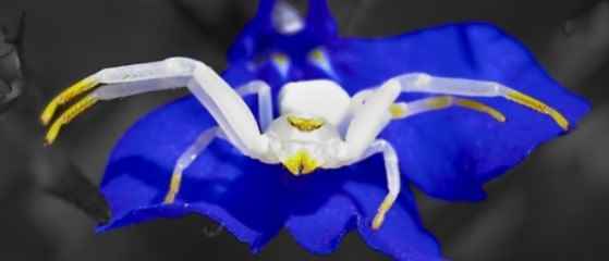
White Spider

Thingography.com
Photo
Gallery

Green

red roses

Thingography.com
Photo Gallery

A Circular Pure CSS Menu – Hover over each colored ball to open menu
]]>
https://thingography.com/css-menu/feed/ 0
CSS Photo Transitions https://thingography.com/css-photo-trans/ https://thingography.com/css-photo-trans/#respond Sat, 24 Mar 2018 13:45:48 +0000 http://thingography.com/?p=2272 .ani-box { margin: 0 auto; width: 100%; height: auto; position: relative; overflow: hidden; } #photos { width: 80%; position: relative; margin: 0 auto; height: 100%; max-width: 980px; top: 0; } .pix1 img, .pix2 img, .pix3 img, .pix4 img, .pix5 img, .pix6 img { width: 100%; visibility: hidden; border-radius: 1px; height: auto; box-shadow: 0 0 2px 2px #000; position: absolute; top: 0; left:0; } .pix2 img, .pix3 img, .pix4 img, .pix5 img { animation-timing-function: linear; animation-duration: 7s; } .pix1 img { margin-top: 0; animation-name: photo; animation-duration: 5s; animation-timing-function: linear; } .pix2 img { animation-name: photo2; animation-delay: 5s; } .pix3 img { animation-name: photo3; animation-delay: 12s; } .pix4 img { animation-name: photo4; animation-delay: 19s; } .pix5 img { animation-name: photo5; animation-delay: 26s; } .pix6 img { animation-name: photo6; animation-delay: 33s; animation-duration: 1000s; animation-timing-function: linear; } @keyframes exit2 { 0% {opacity:0;} 100%{opacity:0;} } @keyframes photo { 0% {transform: rotateX( 0deg); visibility: visible;} 75% {transform: rotateX( 0deg);} 100% {transform: rotateX(90deg);} } @keyframes photo2 { 0% {transform: rotateX(-90deg); visibility: visible;} 20% {transform: rotateX( 0deg);} 75% {transform: rotateX( 0deg) rotateY(0deg);} 100% {transform: rotateY( 90deg);} } @keyframes photo3 { 0% {transform: rotateY(-90deg); visibility: visible;} 20% {transform: rotateY( 0deg);} 75% {transform: rotateY( 0deg);} 100% {transform: rotateY( 90deg);} } @keyframes photo4 { 0% {transform: rotateY(270deg) scale(1,1); visibility: visible;} 20% {transform: rotateY( 0deg) scale(1,1);} 75% {transform: rotateY( 0deg) scale(1,1);} 100% {transform: rotateY( 0deg) scale(0.01,0.01);} } @keyframes photo5 { 0% {transform: scale(0.01,0.01) rotateZ( 0deg); visibility: visible;} 20% {transform: scale(1,1) rotateZ( 0deg);} 75% {transform: scale(1,1) rotateZ( 0deg);} 100% {transform: scale(0.01,0.01) rotateZ(1080deg);} } @keyframes photo6 { 0% {transform: scale(0.01,0.01) rotateZ(1080deg); visibility: visible;} 0.2% {transform: scale(1,1) rotateZ( 0deg);} 0.7% {transform: scale(1,1) rotateZ( 0deg);} 100% {transform: scale(1,1) rotateZ( 0deg);} }
Blue-Flowers
Twilight-moon
Girl-Riding
Hibiscus-Flower
Blue-Flowers
Twilight-moon

A CSS photo transition created with CSS transform. To replay just reload the page.
]]>
https://thingography.com/css-photo-trans/feed/ 0
Walking Dead Zombies – CSS Animation https://thingography.com/css-zombies/ https://thingography.com/css-zombies/#respond Sat, 24 Mar 2018 02:07:21 +0000 http://thingography.com/?p=2268 .ani-box {width:100%; height:100%; margin:0; padding:0;}
Walking Dead Zombies CSS Animation – Created with CSS and PNGs only.
]]>
https://thingography.com/css-zombies/feed/ 0