airplane – Thingography.com https://thingography.com More than a Photo Gallery Wed, 07 Nov 2018 21:07:13 +0000 en-US hourly 1 CSS Animation: Airplane Banner https://thingography.com/vid-airplane-banner/ https://thingography.com/vid-airplane-banner/#respond Wed, 07 Nov 2018 19:25:18 +0000 https://thingography.com/?p=2676 This video is screen capture of a CSS animation that can be found here – https://thingography.com/css-airplane-banner/ – one of my first animations – a bit crude

]]>
https://thingography.com/vid-airplane-banner/feed/ 0
Airplane Plus CSS Animation https://thingography.com/css-airplane-plus/ https://thingography.com/css-airplane-plus/#respond Sun, 18 Feb 2018 18:33:19 +0000 http://thingography.com/my-things/?p=53 /* ================= Animation Start ==================== */ .ani-box {background-color: #7195FF;} #prop { position: absolute; top: 50%; left: 50%; z-index: 3; animation: spin 30s linear infinite; padding: 0; } #plane { top: 50%; left: 50%; position: absolute; margin-top: -100px; margin-left: -250px; padding: 0; margin:0; } @keyframes spin { 0% {transform: rotate(-144000deg);} 100% {transform: rotate(144000deg);} } .fly { position: absolute; top: 80%; left: 50%; z-index:3; width: 20%; float: left; animation: fly 30s linear infinite; } @keyframes fly { 0% {left:80%; top:-20%; transform:scale(0.5);} 25% {left:30%; top:40%;} 50% {left:60%; top:60%;} 75% {left:30%; top:80%;} 100% {left:50%; top:130%; transform:scale(2.1);} } #clouds1 { position: absolute; background: url(http://www.thingography.com/my-things/wp-content/uploads/css-img/airplane-plus/cloudf.png) repeat-x; top: 150px; left: -9000px; bottom: 0; right: 0; height: 400px; z-index: 1; animation: cloud1 300s linear infinite; } @keyframes cloud1 { 0% {left:-9000px;} 100% {left: 9000px;} } #clouds2 { position: absolute; top: -20px; left: -9800px; bottom: 0; right: 0; background: url(http://www.thingography.com/my-things/wp-content/uploads/2017/css-img/airplane-plus/cloudb.png) repeat-x 0 0; height: 400px; z-index: 1; animation: cloud2 400s linear infinite; } @keyframes cloud2 { 0% {left:-9000px;} 100% {left: 9000px;} } #snoopy { position: absolute; top: 100px; left: -400px; z-index: 2; animation: snoopy 30s linear infinite; } @keyframes snoopy { 0% {left: -600px; top:1200px; transform:scale(2);} 60% {left: -600px; top:1200px; transform:scale(2);} 90% {left: 1500px; top:-300px; transform:scale(0.2);} 100%{left: 1500px; top:-300px; transform:scale(0.2);} } #gamera { position: absolute; top: 100px; left: -400px; z-index: 2; animation: gamera 30s linear infinite; animation-delay:5s; } @keyframes gamera { 0% {left: -600px; top:200px; transform:scale(1);} 70% {left: -600px; top:200px; transform:scale(1);} 90% {left: 2500px; top:600px; transform:scale(2);} 100%{left: 2500px; top:600px; transform:scale(0.2);} }
Propeller
BiPlane

Snoopy
Gamera

Okay this one is a little tacky. Similar to the airplane CSS animation, but with moving clouds – a very basic animation which uses a few images.

]]>
https://thingography.com/css-airplane-plus/feed/ 0
Airplane Banner CSS Animation https://thingography.com/css-airplane-banner/ https://thingography.com/css-airplane-banner/#respond Sun, 18 Feb 2018 18:29:07 +0000 http://thingography.com/my-things/?p=41 /* ================= Animation Start ==================== */ .ani-box {background-color: #7195FF;} /*Secondary Blue Background Start*/ .ab-bg { position: absolute; width: 100%; height: 100%; top: 0px; left: 0px; opacity: 0; z-index: 2; background-color: #000099; animation: bg 30s linear infinite; } @keyframes bg { 0% {opacity: 0;} 80% {opacity: 0;} 85% {opacity: 1;} 100%{opacity: 1;} } /*Secondary Blue Background END*/ /*Flying Page Start*/ .ab-content { border: 3px solid #000000; padding: 20px 0 60px 0; width: 880px; color: #000099; background-color: #E6E6E6; margin-top: -200px; margin-left: 170px; height: 400px; position: absolute; z-index: 99999; } @keyframes content { 0% {transform:scale(0.5); } 50% {transform:scale(0.85); z-index: 99999;} 100%{transform:scale(0.85); z-index: 99999;} } .cont-text p { margin: 0px auto 0px auto; padding: 10px 15px 0px 12px; color: #000099; font-size: 1.5em; text-align: center; width: 85%; } .cont-text img { border: 0.5em solid #666666; margin: 1em auto; text-align: center; width: auto; position: relative; height: 85%; } .cont-text img:hover { border-color: #FF0000; } /*Flying Page End*/ #plane { position: absolute; z-index: 3; top: 50%; left: 50%; margin-top: -120px; margin-left: -150px; animation: fly 30s linear infinite; } @keyframes fly { 0% {left:80%; top:0%; transform:scale(0.7);} 20% {left:50%; top:20%;} 40% {left:50%; top:50%;} 60% {left:30%; top:70%;} 80% {left:-10%;top:55%; transform:scale(1.5);} 100%{left:-50%;top:55%; transform:scale(0.5); } } #rope { position: absolute; width: 700px; height: 1px; background-color: #C0C0C0; left: 280px; top: 115px; z-index: 1; animation: rope 30s linear infinite; } @keyframes rope { 0% {opacity: 0;} 100%{opacity: 1;} } .banner { position: absolute; margin-left: 717px; top: 50%; left: 50%; margin-top: -200px; z-index: 3; animation: fly2 30s linear infinite; width: 1195px; height: 600px; } @keyframes fly2 { 0% {left:60%; top:0%; transform:scale(0.1);} 20% {left:40%; top:20%;} 40% {left:80%; top:50%;} 60% {left:70%; top:70%;} 80% {left:50%; top:50%; margin-left: -598px; margin-top: 0px; transform:scale(1.0);} 100%{left:50%; top:50%; margin-left: -598px; margin-top: 0px; transform:scale(1.0);} } #red { /* Used to Fade out Red banner*/ z-index: 1; margin-top: -250px; position: absolute; animation: red 30s linear infinite; } @keyframes red { 0% {opacity: 1;} 90% {opacity: 1;} 92% {opacity: 0;} 100%{opacity: 0;} } /* Clouds Start */ #clouds1 { position: absolute; background: url(http://www.thingography.com/my-things/wp-content/uploads/css-img/airplane-banner/cloudf.png) repeat-x; top: 150px; left: -9000px; bottom: 0; right: 0; height: 400px; z-index: 1; animation: cloud1 300s linear infinite; } @keyframes cloud1 { 0% {left:-9000px;} 100% {left: 9000px;} } #clouds2 { position: absolute; top: -20px; left: -9800px; bottom: 0; right: 0; background: url(http://www.thingography.com/my-things/wp-content/uploads/css-img/airplane-banner/cloudb.png) repeat-x 0 0; height: 400px; z-index: 1; animation: cloud2 400s linear infinite; } @keyframes cloud2 { 0% {left:-9000px;} 100% {left: 9000px;} }
Plane

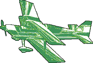
This CSS animation is best viewed in a big screen or desktop computer. Many of these CSS animations are years old and created before “responsive” web pages and mobile devices were dominant. A few images are used with CSS to create the Airplane banner animation. Inspired by my beach days of watching the airplane banners fly by throughout the days.

]]>
https://thingography.com/css-airplane-banner/feed/ 0
Airplane CSS Animation https://thingography.com/css-airplane/ https://thingography.com/css-airplane/#respond Sun, 18 Feb 2018 18:19:51 +0000 http://thingography.com/my-things/?p=38 /* ================= Animation Start ==================== */ .ani-box { background-position: center center;background: url('http://www.thingography.com/my-things/wp-content/uploads/css-img/airplane/sky.jpg') no-repeat fixed center; background-size: cover; } #prop { position: absolute; top: 50%; left: 50%; z-index: 3; animation: spin 30s linear infinite; padding: 0; } #plane { top: 50%; left: 50%; position: absolute; margin-top: -100px; margin-left: -250px; padding: 0; margin:0; } @keyframes spin { 0% {transform: rotate(-144000deg);} 100% {transform: rotate(144000deg);} } .fly { margin: 0px auto 0px auto; position: relative; animation: fly 30s linear infinite; width: 32%; float: left; padding: 0; } @keyframes fly { 0% {left:50%; top:25%; transform:scale(0.2);} 25% {left:20%; top:30%;} 50% {left:60%; top:20%;} 75% {left:15%; top:30%;} 100% {left:50%; top:25%; transform:scale(1.5);} }
propeller
BiPlane

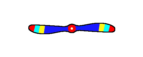
The airplane animation is a very basic and short CSS animation. The most difficult part was keep the spinning propeller stationary while the plane moves and the page is resized.

]]>
https://thingography.com/css-airplane/feed/ 0