Blue
Thingography.com
CSS Animation
Gallery
Yellow
Thingography.com
CSS Animation
Gallery
Red
Thingography.com
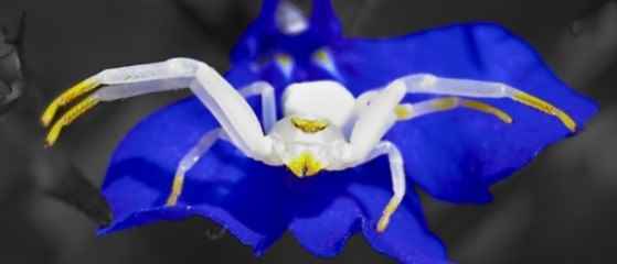
Photo
Gallery
Green

Thingography.com
Photo Gallery
A Circular Pure CSS Menu – Hover over each colored ball to open menu
]]>