.ani-box {position: relative; height: 600px; width: 100%;}
#all {
margin-top: 0;
width: 100%;
height: 100%;
overflow: hidden;
position: relative;
background: rgb(191,159,102);
background: -moz-linear-gradient(top, rgb(191,159,102) 0%, rgb(108,54,20) 100%);
background: -webkit-linear-gradient(top, rgb(191,159,102) 0%,rgb(108,54,20) 100%);
background: linear-gradient(to bottom, rgb(191,159,102) 0%,rgb(108,54,20) 100%);
filter: progid:DXImageTransform.Microsoft.gradient( startColorstr='#bf9f66', endColorstr='#6c3614',GradientType=0 );
}
.bean1, .bean2, .bean3, .bean4, .bean6, .bean5, .bean7, .bean8, .bean9, .bean10, .bean11, .bean12, .bean13, .bean14, .bean15, .bean16, .bean17, .bean18, .bean19, .bean20, .bean21, .bean22, .bean23, .bean24 {
position: absolute;
z-index: 10;
visibility: hidden;
}
/* === Media Query === */
@media screen and (max-width: 480px) {
#text a {
letter-spacing: 2px;
font-size: 2em;
text-shadow: 0 0 1px #000;
}
#text {
margin: 2em auto 0 auto;
}
}
/* ========== Bean Placement and animation setup for 8 x 3 different beans ========== */
.bean1 {
margin-left: 8%;
animation: floatsmall 18s linear infinite;
}
.bean2 {
margin-left: 35%;
animation: float 10s linear infinite;
}
.bean3 {
margin-left: 75%;
animation: float 11s linear infinite, left 11s infinite;
}
.bean4 {
margin-left: 60%;
animation: float 12s linear infinite;
}
.bean5 {
margin-left: 85%;
animation: floatsmall 8s linear infinite;
}
.bean6 {
margin-left: 20%;
animation: float 12s linear infinite, left 12s infinite;
}
.bean7 {
margin-left: 30%;
animation: floatsmall 9s linear infinite, right 9s infinite;
}
.bean8 {
margin-left: 45%;
animation: float 7s linear infinite;
}
.bean9 {
margin-left: 1%;
animation: float 10s linear infinite, right 10s infinite;
}
.bean10 {
margin-left: 96%;
animation: float 15s linear infinite, right 15s infinite;
}
.bean11 {
margin-left: 52%;
animation: float 18s linear infinite;
}
.bean12 {
margin-left: 92%;
animation: float 13s linear infinite;
}
.bean13 {
margin-left: 17%;
animation: float 17s linear infinite;
}
.bean14 {
margin-left: 67%;
animation: float 15s linear infinite;
}
.bean15 {
margin-left: 77%;
animation: float 10s linear infinite;
}
.bean16 {
margin-left: 20%;
animation:float 20s linear infinite;
}
.bean17 {
margin-left: 57%;
animation:float 8s linear infinite;
}
.bean18 {
margin-left: 60%;
animation: floatsmall 14s linear infinite;
}
.bean19 {
margin-left: 44%;
animation:float 17s linear infinite;
}
.bean20 {
margin-left: 41%;
animation:float 11s linear infinite;
}
.bean21 {
margin-left: 32%;
animation: floatsmall 20s linear infinite;
}
.bean22 {
margin-left: 70%;
animation: float 20s linear infinite, left 20s infinite;
}
.bean23 {
margin-left: 10%;
animation:float 19s linear infinite;
}
.bean24 {
margin-left: 20%;
animation: float 16s linear infinite;
}
/* Coffee Bean Animation Keyframes */
@keyframes float {
0% {visibility:visible; top:-20%; transform:rotateZ( 0deg);}
100%{visibility:visible; top:1000px; transform:rotateZ(720deg);}
}
/* === FLOATSMALL === */
@keyframes floatsmall {
0% {visibility:visible; top:-20%; transform:rotateZ( 0deg);}
100%{visibility:visible; top:1000px; transform:rotateZ(720deg);}
}
/* === LEFT === */
}
@keyframes left {
0% {visibility:visible; transform:translateX( 0px) rotateZ( 0deg);}
100%{visibility:visible; transform:translateX(-400px) rotateZ(720deg);}
}
/* === RIGHT === */
@keyframes right {
0% {visibility:visible; transform:translateX( 0px) rotateZ( 0deg);}
100%{visibility:visible; transform:translateX(300px) rotateZ(-720deg);}
}
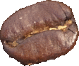
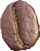
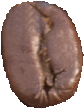
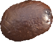
It’s raining coffee beans! The falling coffee beans CSS animation gives the illusion of perpetual falling coffee beans. Substituting the coffee bean images with other images can create a magnitude of effects as with other animations in my collection.
]]>