.ani-box {width: 100%; height: auto; overflow: hidden;
background-color: #000020;
animation: bgcc 60s infinite;
}
.tunnel-box {
margin: 0 auto;
width: 100%;
max-width: 1000px;
height: auto;
position: relative;
padding: 1em 0;
}
.tunnel {
width: 60%;
height: auto;
margin: 0 auto;
text-align: center;
}
.tunnel img {
transform-origin: 50% 50%;
animation: tunnel 60s infinite;
width: 100%; height: auto;
}
@keyframes tunnel {
0% {transform: rotate(0deg);}
50% {transform: rotate(14400deg);}
100% {transform: rotate(0deg);}
}
@keyframes bgcc {
0% {background:#FFF;}
50% {background:#CCC;}
100% {background:#FFF;}
}
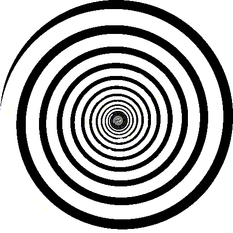
This was one of my first animations while learning CSS – A Television show from the 1960’s – The Time Tunnel.
]]>